Friday, 16 July 2010

altered box no1


I had a play with 2 boxes recently. This is the pretty one. Painted with pearly pink and pale turquoise, and very girly lace and flowers added as well as an image i have had in my stamps box for a while. It was the one which best matched the colours i had used.

Wednesday, 7 July 2010

mini album


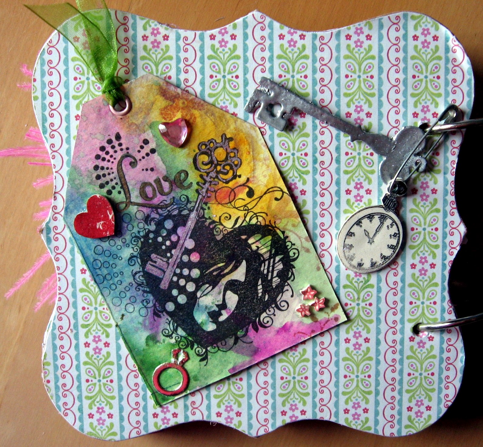
I bought a papermania chipboard album and decided to use the free paper stack in the latest C&P magazine to decorate it. Here are some of the pages.
I just had to use my new birdcage die too.I made 3 flowers from an oddment of ribbon and LLB brads a couple of weeks ago and used one on the front cover too. For the back cover I used a tag which has been painted with H2Os and some distress inks,stamped and the key coloured with a sakura pen. The small heart is stamped shrink plastic and so is the watch. The key is a die cut from grungepaper and embossed with silver. The safety pin has been alcohol inked by putting in a plastic bag with 2 drops of "stream" and shaken till it was covered.


Sunday, 13 June 2010

T.H. again

Another Tim Holtz inspired card.My lovely old dictionary finally bit the dust, but parts of it will live on in my crafting. It was used for the flower in this card, along with some distress inks. The flourishes are both sizzix dies, only 1 of which is Tim Holtz. The cog effect was done by nibbling the circles all round with a cropadile. It is much easier to just buy circle nesties with fancy edges....which I now have, but too late for this card. The background was done using a large Tim Holtz mask on silver coloured card. I think the inks were corduroy and tumbled glass. The fabric is a bit of primed canvas roughed up a little and stamped with distress inks and a paperartsy cogs stamp, watch is cut from a crafty individuals stamp.

Friday, 11 June 2010

Altered canvas


I had sprayed this canvas with crafty notions glimmery inks and cut the 2" squares when I bought this months Craft Stamper mag and found they were featuring a similar idea. Theirs is gorgeous, but mainly red. A colour I am not especially fond of. I gravitate more to the cool colours.Since I hadn't finished deciding what to decorate the squares with I used the fabulous seashell stamp that came with the mag. I was already going to do the seahorses and insects so it was perfect.


Friday, 4 June 2010

Tim Holtz inspired cards


I have been enjoying using some new Tim Holtz stash. I am building a nice collection of his products, from alcohol and distress inks to grungeboard and the fabulous backing papers used in these cards. Plus stamps and masks and the fantastic new dies.
I have a strip of balsa wood that was just crying out to be inked with distress inks and stamped onto.I like the textured effect. Its the car above on the bottletop paper.